2. Design Guidelines
2.1 Logotype
Our logo, featuring the bold abbreviation “WTF” for “White Teeth Forever,” is the key element of our brand. The smile shape highlights dental focus, while the strong, capitalized letters convey confidence and trustworthiness.

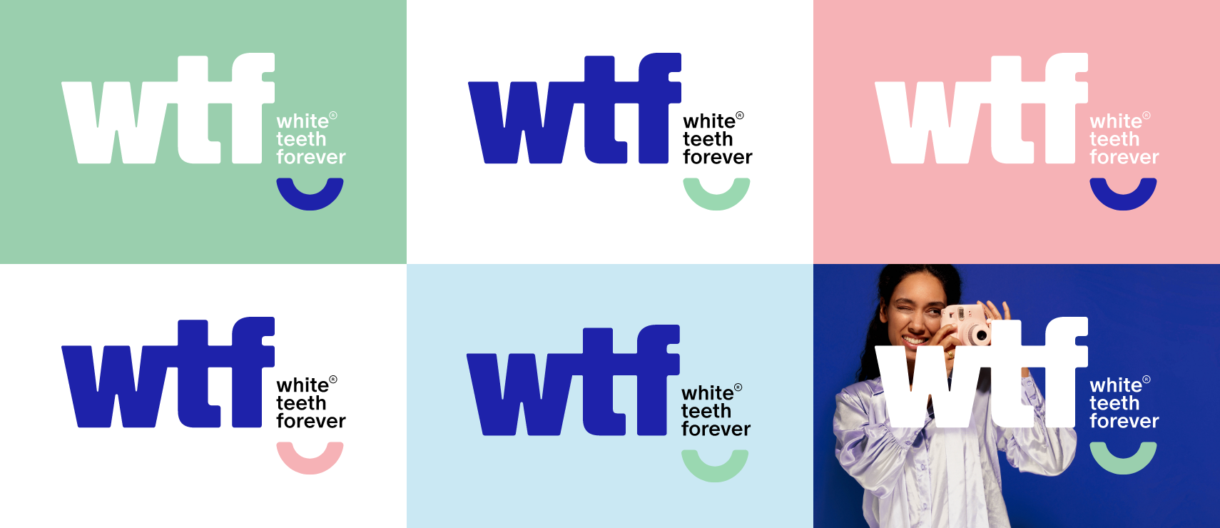
When using the inverted logo, all elements should be white, except for the smile shape, which can be colored.

2.2 Logo rules, sizes & margins
Our logo may be used in dark blue or white. The smile element is the only part that can change color, preferably green.
Avoid combining pink and green; instead, pair one with dark blue, light blue, or white. Choose logo colors based on your design for contrast and clarity.
Over photography, use white or green/pink for legibility. Never use light blue for the logo.
To look its best, our logo needs space to stand out. No other elements encroach on this clear space. Except one of the stickers.
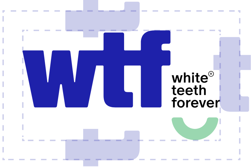

For clarity across digital and print applications our logo should never be reproduced at any size below the adjacent guidance.

Minimum 35mm
Please use the logo with respect.
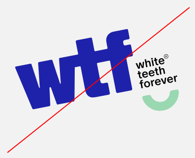 Don't rotate
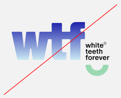 Don't apply gradients
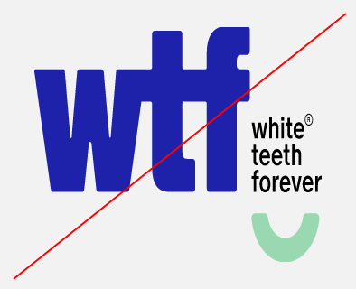 Don't stretch
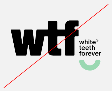 Don't use other colors
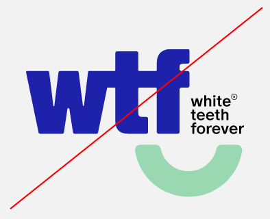 Don't change hyrarchy
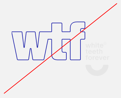 Don't outline the logo
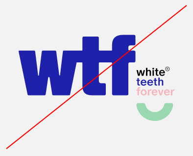 Don't use multiple colors
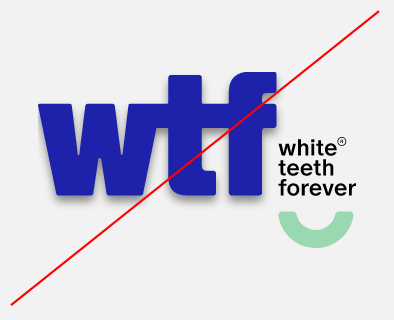 Don't use shadows
2.3 Brand mark
The smile is the brand’s key symbol and can be used either as a solid shape or an outline.


2.4 Graphic devices
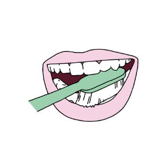
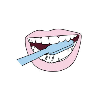
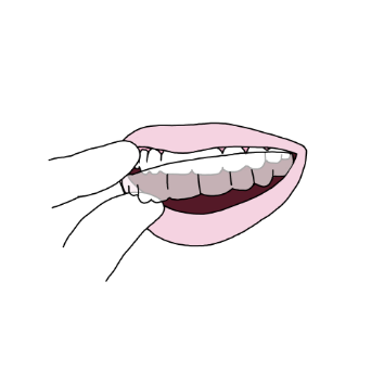
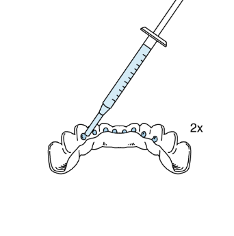
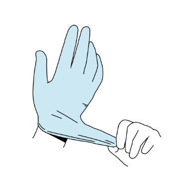
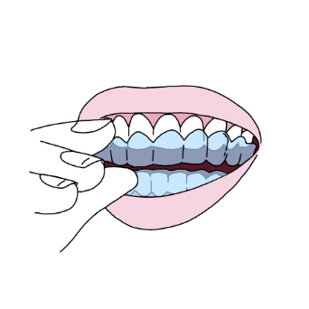
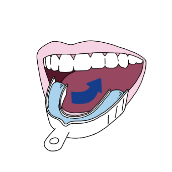
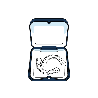
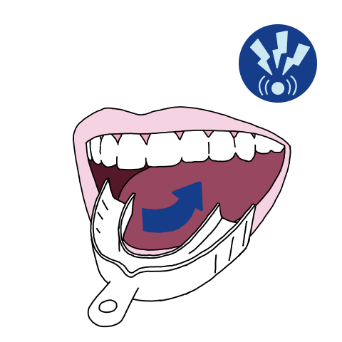
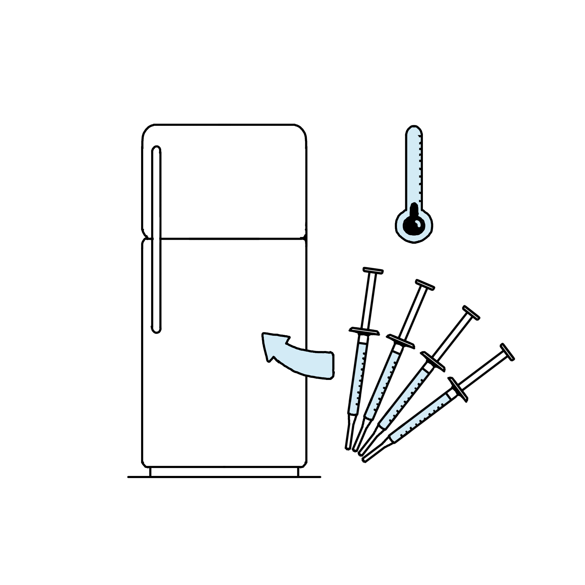
A special set of hand-drawn illustrations has been designed to guide consumers through each step of the product usage process.


2.5 Typography
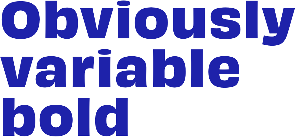
We have one typeface we use for all of our headlines: Obviously Variable Bold.
Featuring many fine details, moderate contrast and slightly unusual anatomy, the typeface can be a loud and proud hero or a humble supporting actor for all sorts of designs.
Spacing = 25
Line spacing = fontsize x 1
Obviously Variable Narrow Semibold Italic
Spacing = 0
Line spacing = fontsize x 1

Obviously Variable Regular
Spacing = 0
Line spacing = fontsize x 1.5
Ecto dolupid entemol uptaquia suntibus, ilitias que sectotat. Dem dolore doles aut ut dendanditiam et maion pore exeri comni aped mo volupta tibusanimet as earume inus dempor archil est minumquam que veniet exceped maxim comnima ximolupti della pre cum fuga. Et harit est, quunt ium voloriosa con reprepro consent quam apienduntem eiuntinume pratemp elibeat et ullaut molupti assimintur, tendior untota vidempos ame dolutem est, simint ut acearchit quo qui rerferum et que recepelictem di dunt. Ferchilitio cum aceatum volorum quidebita ipsapiet quodit ero conecte caborepra voluptatium, ium re consent invella borpos voluptaque sim fuga. Il in rerum quodis est ut autateni nihit volutem entoribearum iniet que autatias voluptae nis reptas simi, exerfere voluptas et quis quis qui aruptassum, sant laccus a nos a nonse lacepe porepra taquam estis esci nobitatur alisitem. Aque cus alibus veri odic totatiur, nossequia pro te nest que illore inullignam nient es dent odis nis num fuga. Itassim inctatur?
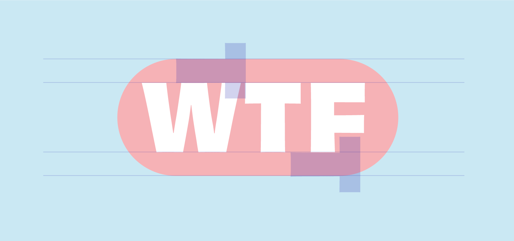
WTF is always written in capitals. The background is a rectangle in one of the brand colors with rounded corners.
The height of the background =
x-height WTF + width T
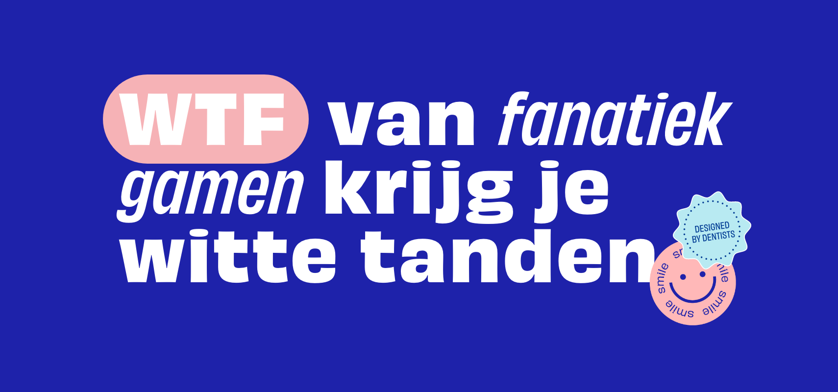
The heading is always the ‘obviously variable bold’.
WTF is always written in capitals. The sentence' highlight is always in the ‘Obviously Variable Narrow Semibold Italic’
Spacing = 0 pt.
Line spacing = fontsize x 1.1
2.6 Color usage
Our main set of colors are a handful of color combinations.
C100 M80 Y0 K10
R30 G34 B70
PMS: 2736
#1E22AA
C45 M0 Y40 K0
R154 G216 B177
PMS: 353
#9ACFAE
C0 M40 Y20 K0
R255 G184 B184
PMS: 2238
#FFB7B7
C25 M0 Y5 K0
R204 G233 B243
PMS: 628
#CAE8F3
C0 M0 Y0 K0
R255 G255 B255
PMS: WHITE
#FFFFFF
2.7 Imagery

2.8 Stickers
A special set of stickers have been created to bring our brand to life.
